Over the years, Music Library has been a playground of sorts for exploring various open source libraries, patterns, and best practices. While there is still a fair amount of code I would write differently today (I’m looking at you, ContentProvider), the app has been and continues to be an enjoyable side project.
Whether fixing bugs or implementing new features, I adhere to the Boy Scout Rule as much as possible, balancing the urge to rewrite everything with what makes sense for the changes being made. Despite my attempts at pragmatism, Google’s roughly semiannual overhaul of the Android UI has a way of quickly dating apps that do not keep up with the latest design guidelines. Remember gradients everywhere in Gingerbread? Or when Honeycomb and Holo ushered in the last big design change? Material Design continues that tradition, only more ambitious in scope; this time unifying the design of mobile, web, and Chromebook apps in one fell swoop.
The official announcement of Lollipop and the release of the latest support library last month motivated me to update Music Library yet again to keep up with the latest evolution of the platform. After surveying the contents of the new version of the support library, I got to work bringing Material Design to the app.
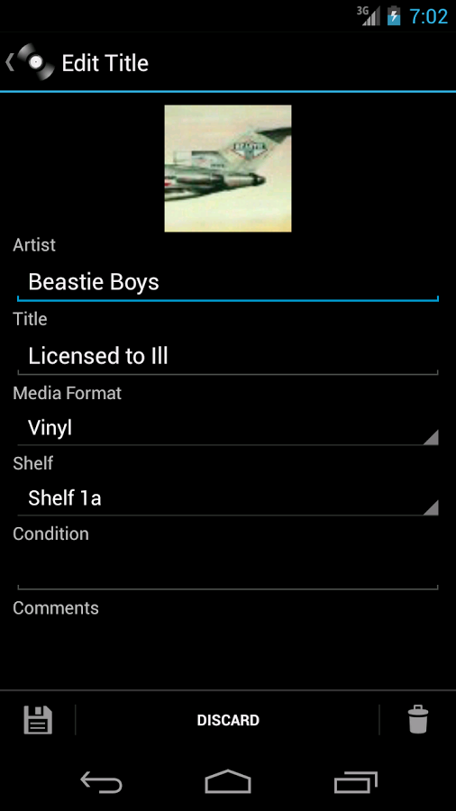
I started by applying the Theme.AppCompat.Light.DarkActionBar theme as described on the Android Developers blog, which changed the action bar, color scheme, and widgets from the now too-familiar Holo electric blue to the new Material look.
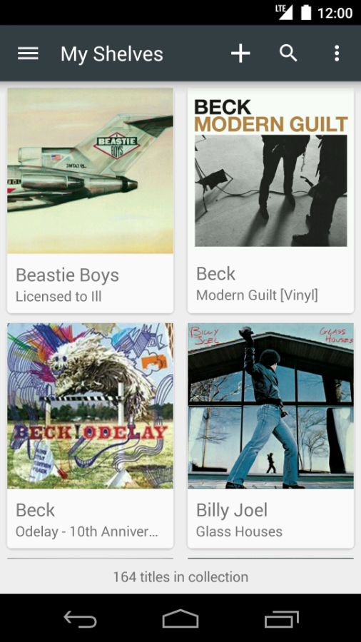
Once that was done, I found that the spinner navigation the app was using has been deprecated in Lollipop. Taking a cue from Google’s own apps such as Gmail and the Play Store, I decided to move the shelf list into a left navigation drawer. Menu options such as Scan Barcode, Settings, and editing the list of shelves also moved into the nav drawer. This left only the more common actions of Add, Edit, Search, and Sort in the action bar/overflow menu, cleaning things up significantly.
From there, I turned to the album art images, making them more prominent throughout the app. I used the GridLayoutManager and CardView widget to display the list of albums in a grid rather than a list, putting the focus on the artwork that makes our favorite albums immediately recognizable. This had the additional benefit of obviating the coverflow view that while fun to play with, always felt a bit out of place on Android.
To further enhance the look of the app, I used the Palette library to extract a dark vibrant color from each album’s artwork for the action bar and fonts. As the selected album changes, the app’s colors morph to complement the artwork. I’m amazed how well it works. I’ve yet to see a case where it didn’t result in just the right color for the image being displayed.
As you can see from the before and after screen shots below, the redesign breathes new life into the app. I’m quite pleased with the result. I look forward to applying more Material Design elements to this app and others over the next few months.
| Version 2.x (Holo) | Version 3.0 (Material Design) |
|---|---|
 |  |
 |  |