
Originally published on the Zalando Engineering Blog
Introduction
The CSS Flexible Box Layout specification (AKA flexbox) is a useful abstraction for describing layouts in a platform agnostic way. For this reason, it is widely used on the web and even on mobile. Readers familiar with ConstraintLayout can think of flexbox as conceptually similar to the Flow virtual layout it supports. This type of layout is ideal for grids or other groups of views with varying sizes.
In the Zalando Fashion Store apps, we are using flexbox to define the layout of our backend-driven screens, which I spoke about previously. Thus far, we have been using Litho on Android and Texture on iOS (both of which use the flexbox based Yoga layout engine) for rendering backend driven screens because they support things that are essential when building fully dynamic UI at runtime such as async layout, efficient diffing of changes, and view flattening.
As Google prepares Jetpack Compose (now in beta) for production release, we have started evaluating it as a successor to Litho. Compose offers numerous layout composables, many with bits of flexbox like behavior. However, there is no Flexbox composable that does it all and no blog post explaining how flexbox concepts map to Compose, so I wrote this one. I also built this sample app, parts of which I will reference in code examples below.
Before we continue, yes, I know technically it’s called Compose UI and not simply Compose, but as Jake said, most of us are already thinking of it this way. Insert a “UI” where necessary while reading if you’d like.
Flex
Let’s start with the flex attributes, which describe the direction, size, and horizontal/vertical alignment of a layout’s children.
Flex Direction
Flex direction specifies whether items are arranged vertically or horizontally. Compose has Row and Column composables that work for simple horizontal and vertical layouts.
If flex wrap behavior is needed to control how items wrap across multiple rows, the FlowRow and FlowColumn composables will do this. However, these were deprecated before I even finished writing this article, so the best we can do is use the old implementation as a reference for our own.
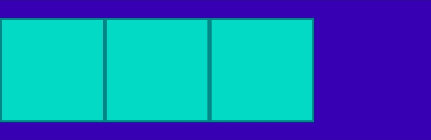
Flex Grow & Shrink
The above code results in the following UI:

Flex Grow & Shrink
Flex grow controls how children will expand to fill available space in their parent layout. Flex shrink is its opposite, controlling how children will shrink relative to siblings if their parent layout does not have room for all of them.
Use the weight() modifier for flex grow behavior. Compose does not really have a flex shrink analog, but with its variety of layout composables, this can be overcome with a different approach in most cases. Depending on your specific needs, one approach could be to use Modifier.preferredWidth(IntrinsicSize.Min) to specify that a composable should not take up any more space than its children require. You can read more about it here in this question reposted from the kotlinlang Slack in Mr. Mark Murphy’s excellent jetc.dev newsletter.
The above code results in the following UI:

When the utmost flexibility is needed, there’s always implementing your own Layout composable or the raw power of the ConstraintLayout composable, which can be used directly from Compose. If you don’t mind reading Java instead of Kotlin, the implementation in Google’s flexbox-layout library is a good starting point for understanding the algorithm.
Alignment
Alignment controls how items are arranged on their vertical and horizontal axes. This can be done on a parent layout with the *-content properties or on the children themselves using the *-self properties.
Main Axis
Main axis alignment refers to how children are aligned on the main axis of their parent; horizontal for rows and vertical for columns. In the flexbox spec, this is known as justify-content. In Compose, main axis alignment is controlled by the the horizontalArrangement parameter passed to Row and the verticalArrangement parameter passed to Column. Both include options such as start/end, center, and space around/between/evenly for possible values.
The above code results in the following UI:

Cross Axis
Cross axis alignment refers to how children are aligned on the non-main axis of their parent; vertical for rows and horizontal for columns. In the flexbox spec, align-items and align-content control layout children while align-self allows children to do so themselves. In Compose, cross axis alignment is controlled by the verticalAlignment parameter passed to Row, the horizontalAlignment parameter passed to Column, and the align modifier on their child composables. Both include options start, end, and center for possible values.
The above code results in the following UI:
You may have noticed that the space around/between/evenly options from justify-content are not listed for the cross axis. This is because there is no cross axis space around/between alignment in Compose. However, the resulting layout could be achieved via other composable combinations.
Flexbox also specifies a stretch option for cross axis alignment. In Compose, the stretch equivalent would be individual children using the fillMaxSize()/fillMaxWidth()/fillMaxHeight() modifiers.
Layout
Finally, let’s look at a few other attributes that affect a view’s size and position.
Aspect Ratio
Compose’s aspectRatio() modifier works exactly as you’d expect. It takes a float representing the desired ratio and uses that value to determine the size in the unspecified layout direction (width or height).
For example, specifying fillMaxWidth() and aspectRatio(16F / 9F) results in a rectangle that fills the width of the screen with a height corresponding to 9/16 of that width.
The above code results in the following UI:

Padding & Margins
Compose has a padding() modifier, but none for margins. Margins can be considered extra padding, so a single value can be used.
Absolute Position
When absolute positioning is needed to place one composable on top of another, the Box composable can be used. Box children can use the align() modifier to specify where they are aligned within the box including top start/center/end, bottom start/center/end, and center start/end.
The above code results in the following UI:

Conclusion
In this article, we have seen how much of the layout behavior defined in the flexbox spec has a direct analog in Compose and a few places where we have to do a bit more work to approximate certain concepts. Please see the sample app repo for the code as well as my first attempt at working with the Compose Navigation library.
During our recent Hack Week, we had a chance to spend more time with Compose. We were impressed with how easy it was to get started and managed to build a fairly performant Compose powered implementation of our home screen. For a beta, it’s quite promising!
Thanks for reading!
We’re hiring! Consider joining our teams who work on the Zalando Mobile App and build user experiences for our customers.